Otago Polytechnic Ltd needed a new brand for their student village. They wanted it to represent them but to also work with the brand for Te Pukenga, the new entity that will soon amalgamate all tertiary learning institutions in Aotearoa, New Zealand. I looked at both brands and used common typefaces and colours.
The name of the village was gifted by local Iwi, Kai Tahu and I developed a form that represents shelter and shows the lines and shapes of a cockleshell discovered in a midden by Hori Kerei (“H.K.”) Taiaroa, which has been used to create the names for the 5 different floors of the village. The colours are gradients created from OP Blue, OP Cyan and OP Green. The strapline ‘Student village’ is used to indicate more than just accommodation - a sense of community, shared kai, and support as well as physical shelter.
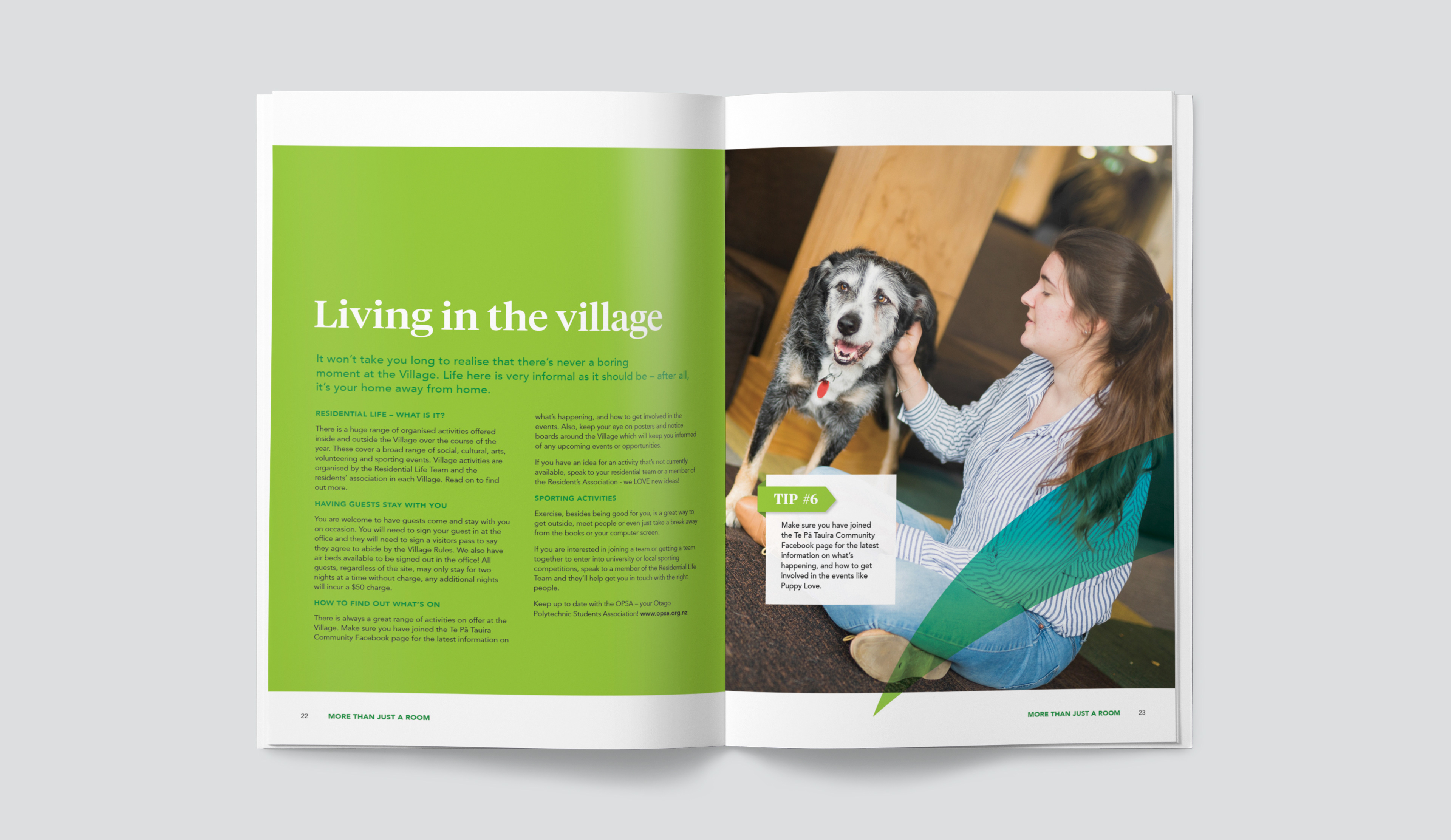
Among the collateral we produced were signage, flags, business cards, banners and a hand book for residents.


